Throughout the years there have been a number of occasions where I simply wanted to share the map layers and location of what was on my screen. For example, I would have a compelling side-by-side comparison that I wanted to show a colleague or a student — but someone unfamiliar with geteach.com might have difficulty selecting the right mapset and toggling on the correct layers.
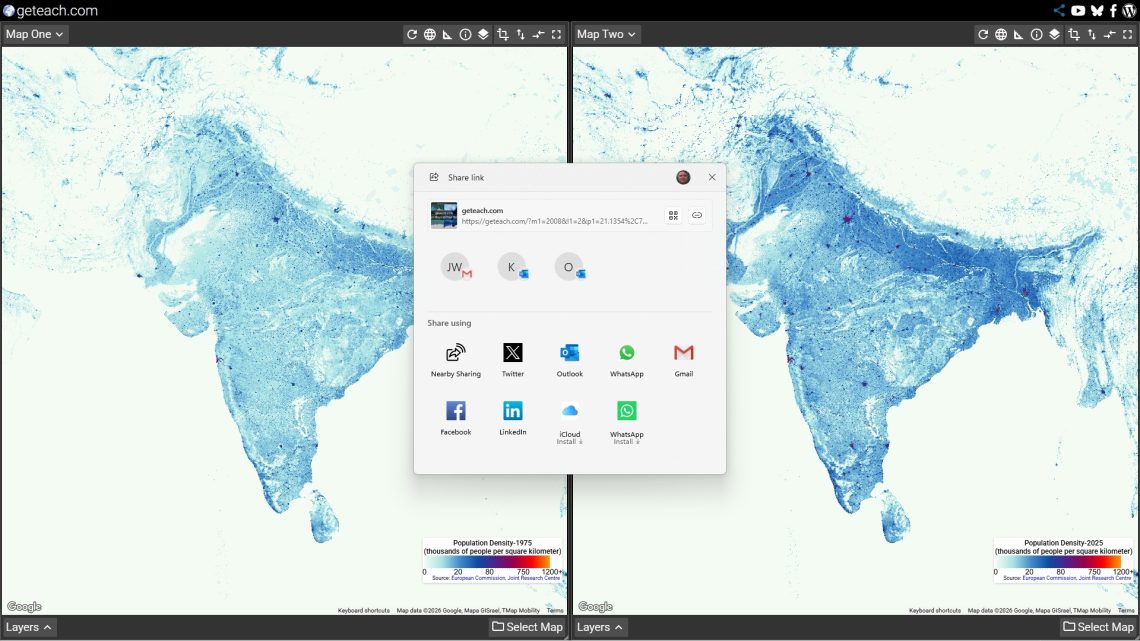
Recently, I solved this barrier by adding a share function to geteach.com. One click captures everything on your screen into a single URL. Anyone who opens that link lands in exactly the same state you were in — no setup required on their end.
What the Link Captures
The share function encodes the full state of both map canvases — a lot more than just the active layer. For each canvas it captures the active mapset and selected layers, the exact map position and zoom level, the map type (roadmap, satellite, hybrid, or terrain), visual style toggles for boundary lines, labels, and roads, and the visibility state of the legend, map controls, and drawing tools. It also captures whether the two canvases are synchronized by center and zoom.
This means a carefully arranged side-by-side comparison — Population Density on roadmap alongside Earth at Night on satellite, for example — is shared in its entirety. Both maps, both layers, both positions, all at once.
I would have a cool comparison that I wanted to share, but people unfamiliar with geteach.com might have a problem selecting the mapset and toggling on the layers. Recently, I solved this barrier.
How to Use It
Navigate to geteach.com, set up the view you want to share — layers, zoom, map type, any toggles — then click the Share button. On most browsers the link is copied directly to your clipboard and you’ll see the “Link copied to clipboard” confirmation. On mobile devices that support it, the native share sheet opens, letting you send the link straight to Messages, email, or another app.
Paste it wherever your audience will find it — a Google Classroom post, an email, a slide deck, a shared document. When they open the link, geteach.com restores your exact configuration automatically.
Examples in the Classroom
Here are four comparisons built with the share function — each ready to drop into a lesson or post directly to your LMS. Click the heading of each example to open the comparison in geteach.com.
Austin — Site, Situation, and Urban Morphology
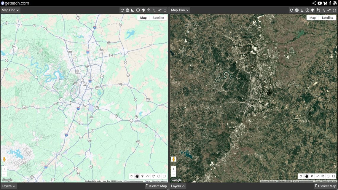
One canvas shows Austin on a terrain map; the other shows the same footprint on satellite. The city’s growth pattern runs strongly north–south — constrained to the east by the Blackland Prairie and to the west by the rugged Hill Country. This is a strong entry point for discussing how physical geography shapes site and situation, and why some cities grow in one direction rather than spreading evenly. Ask students: what physical features act as barriers here, and what draws development along the corridors you can see?
El Niño — Winter vs. Summer Climate Shifts
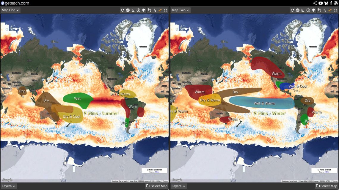
This comparison layers El Niño climate anomaly data for winter on one canvas and summer on the other, both centered on the Pacific. El Niño redistributes precipitation and temperature across entire continents — wetter winters across the southern U.S., drier conditions across Southeast Asia and Australia. Use this as a discussion starter for climate variability and food security: where do growing seasons shorten? Which regions face drought risk? How might shifts in precipitation affect crop yields in regions that depend on predictable monsoons? Students can also connect this to their own region and consider local impacts.
Dependency Ratios — Africa and Europe
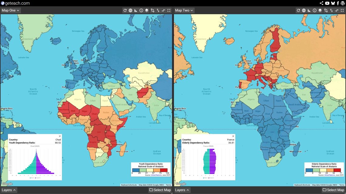
Youth dependency ratio on the left, elderly dependency ratio on the right — centered to show both Sub-Saharan Africa and Europe in a single view. The contrast is stark: much of Africa carries a high youth dependency burden while many European countries face the opposite pressure from aging populations. This is a natural entry point for demographic transition, social policy, and economic development. Ask students what each pattern implies for education spending, pension systems, labor force participation, and healthcare demand. Click individual countries for the underlying data — and don’t forget to pan to see how the patterns shift across regions.
Easter Egg — Wizarding World vs. Springfield
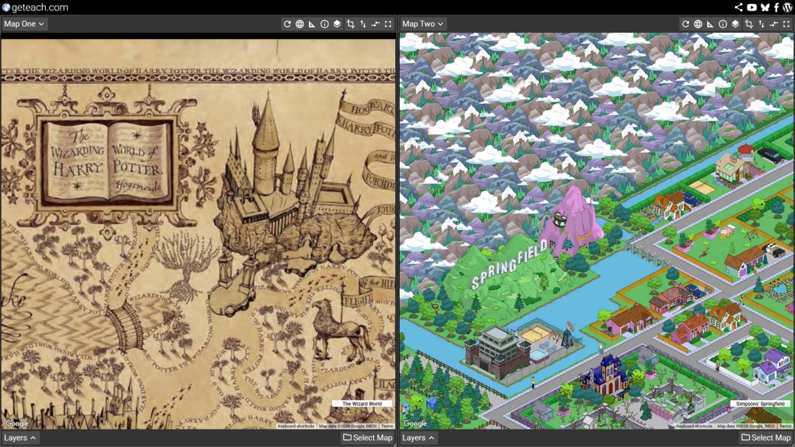
A few of the map sets include easter eggs hidden across the data layers. This one places Harry Potter’s Wizarding World on the left canvas alongside the Simpsons’ Springfield on the right. More of a reward for explorers than a lesson plan — but if you need an excuse, there’s a reasonable argument for a discussion about fictional geography and spatial imagination. Where do these places exist relative to the real world? Either way, students tend to enjoy finding these.
Share Your Comparisons — #geteachmaps
If you build a comparison worth sharing, tag it with #geteachmaps on Bluesky or Facebook. Whether it’s a side-by-side of HDI across decades, a terrain view of a region you’re studying, or just something that made a student say “whoa” — I’d genuinely love to see what people build with this.
And if you have ideas for how the share function could be more useful, reach out via Bluesky, Facebook, or email.