Same Earth: Different Boundaries and Toponyms

Google Maps 3D API – Boundaries: https://geteach.com/boundaries

A quick note before I get into it: this is a side project, not part of my main classroom toolkit. GeTeach.com is still where I do the bulk of my actual teaching, and that’s not changing. This website is smaller in scope, built more to explore a specific idea than to replace anything. It’s also worth saying upfront that this build is running on the alpha channel of the Maps JavaScript API, not the standard weekly release, so some of what’s described here may change. I’ll switch the site over to the weekly channel once ROADMAP support lands there.

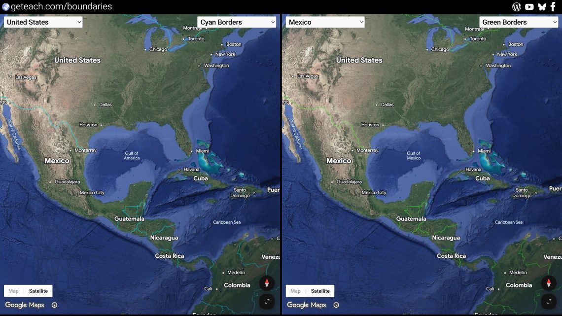
Most border disputes are invisible on a normal map. You get one line, drawn from one point of view, and that’s presented as fact. And it’s not just lines. Names shift too: the same body of water, mountain, or sea can carry two completely different labels depending on who’s making the map. The opening flight on this page lands over the Gulf of Mexico for exactly that reason. Set the region to US and it reads “Gulf of America”; set it to almost anywhere else and it reads “Gulf of Mexico (Gulf of America).” Same water, same coordinates, two names. Google Maps encodes both of these behaviors, borders and toponyms, through the API’s region parameter, which changes what gets rendered and labeled depending on which country’s context you tell it you’re in. So I built a page with two globes side by side, each locked to a different region, moving in perfect sync, so students can pan to the exact same spot on both globes and see two different perspectives of the same place, borders, names, and all, live.

Left Map Region: United States | Right Map Region: Mexico

Why digital maps do this

This isn’t a bug or an oversight. It’s deliberate, and every major map provider does some version of it, for both borders and toponyms. Companies operating in a given country are generally expected to follow that country’s legal or official position on its own territory and place names, and in several countries that’s not optional: showing a “wrong” border or a name a government hasn’t recognized can get a map product restricted, fined, or blocked outright. So rather than pick one global version of the truth, providers render borders and labels conditionally, keyed off the viewer’s country, domain, or in this case, an explicit region setting, so a map viewed from the US, Mexico, India, Pakistan, or anywhere else can show a version consistent with that country’s official stance, right down to what a body of water is called.

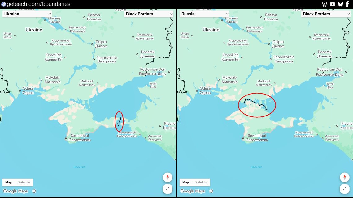
Left Map Region: Ukraine | Right Map Region: Russia

For a classroom, that’s less a technical footnote than the whole lesson. Most students assume a map is just a neutral picture of the world. Watching the same coordinates redraw their borders, or rename themselves, depending on which “region” you tell the API you’re in is a fast way to show them that maps are arguments too, made by someone, for someone.

Google Maps 3D API Documentation: https://developers.google.com/maps/documentation/javascript/reference/3d-map

Here’s how the pieces fit.

Two independent globes, one shared camera

Each side of the page is its own Map3DElement, wrapped in a small EarthView class that tracks its own camera state (center, range, tilt, heading) and exposes getCamera() / setCamera(). Nothing unusual there. The interesting part is keeping them locked together without one map fighting the other for control:

function createFocusSync(mapA, mapB) {
  let driver = null;
 
  const setDriver = (map, camera, stopped = false) => {
    if (stopped) { driver = null; return; }
    if (!map.isProgrammatic()) driver = map;
  };
 
  mapA.onCameraChange(setDriver);
  mapB.onCameraChange(setDriver);
 
  const tick = () => {
    if (driver && !driver.isProgrammatic()) {
      const follower = driver === mapA ? mapB : mapA;
      follower.setCamera(driver.getCamera());
    }
    requestAnimationFrame(tick);
  };
  tick();
}

Whichever globe the user is actively dragging becomes the “driver” for that gesture; the other globe just follows. The _isProgrammaticMove flag on EarthView is what keeps this from turning into an infinite feedback loop. Every time I set a camera programmatically, I flag it so the resulting gmp-centerchange event doesn’t get mistaken for a new user drag and hijack the driver role.

The region parameter is the whole point

Each Map3DElement gets its own region string, and a dropdown per side lets students swap it live:

setRegion(regionCode) {
  this.map.region = regionCode;
}

Left globe set to US, right globe set to RU, both centered on the same coordinates. Pan over to Crimea, and the two globes will label and border it differently, even though it’s the exact same latitude and longitude on both screens. That single-line diff is a better opener for a discussion on cartographic sovereignty than any lecture slide I’ve made.

Map mode, and boundary colors

Each globe defaults to a plain roadmap view rather than satellite hybrid, with a small Map/Satellite toggle button on the lower left so students can flip between the two. That pairs naturally with the color options below: roadmap keeps the background flat and neutral so the border color itself is the whole story, while satellite mode brings the terrain-contrast problem back in and lets students see why a color that worked over ocean might disappear over desert.

const setMapMode = (earthView, modeString, mapBtn, satBtn) => {
  if (earthView && earthView.map) {
    earthView.map.mode = modeString;
    if (modeString === 'ROADMAP') {
      mapBtn.classList.add('active');
      satBtn.classList.remove('active');
    } else {
      satBtn.classList.add('active');
      mapBtn.classList.remove('active');
    }
  }
};

I also wanted to swap the style of the borders, not just where they are but how visible they are, using six mapIds pre-configured with different boundary line colors: black, white, magenta, cyan, orange, and green. Satellite imagery isn’t one consistent background. Desert, forest, ocean, and snow all sit at different brightness and hue, so a border color that pops over one terrain can disappear over another. Having six colors on tap lets a teacher pick whichever one actually stands out against the terrain a lesson is centered on, rather than fighting a single fixed color that only works half the time. Widening the line itself would help too, since a thicker border reads better at a distance than a differently colored thin one, but Google Cloud’s map styling doesn’t currently expose a line-width control for these boundaries.

colorLeft.addEventListener("change", () => {
  if (window.leftEarth && window.leftEarth.map) {
    window.leftEarth.map.mapId = colorLeft.value;
  }
})

Worth a note on why the colors were finicky to begin with. The 3D API only supports cloud-based styling through the Google Cloud console, not the older, more predictable JSON styling most Maps developers are used to. On top of that, Google doesn’t currently offer a live preview for 3D styles, and changes can take a few hours to show up. Editing blind and waiting on a slow rollout meant I had to recreate a few of the color styles from scratch to get consistent results, even though they were all configured the same way underneath.

One dropdown, 190-some countries

The region and place-name behavior only works if students can actually pick a country, so both dropdowns are populated from a flat ISO 3166-1 alpha-2 lookup table at load time:

function populateSelect(selectEl) {
  for (const [code, name] of Object.entries(regions)) {
    const option = document.createElement("option");
    option.value = code;
    option.textContent = name;
    selectEl.appendChild(option);
  }
}

Defaults are US on the left and RU on the right, which was as good a first example of border/toponym divergence as I could think of. But the fun part of the lesson is letting students pick their own pair and go looking for the next one.

What I’d explore next

Three pairings I keep coming back to when I test this with students:

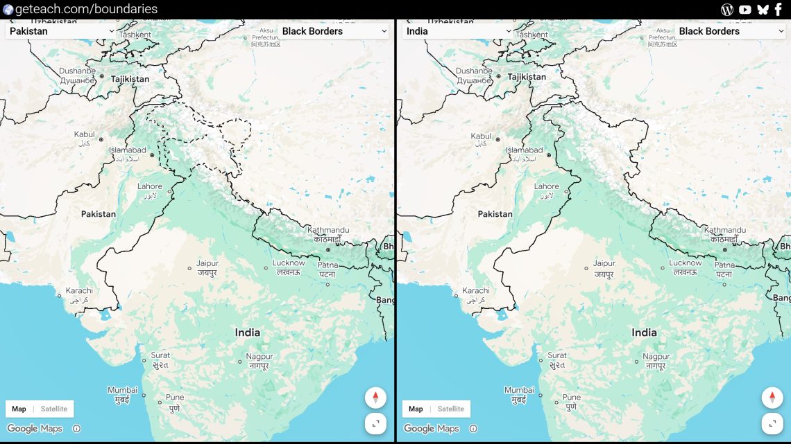
Left Map Region: Pakistan | Right Map Region: India

Pakistan set as the region with India, panning over Kashmir. The line of control gets drawn differently depending on which side of the page you’re looking at, and it’s a good prompt for asking students what a “border” even means when two governments won’t agree on one.


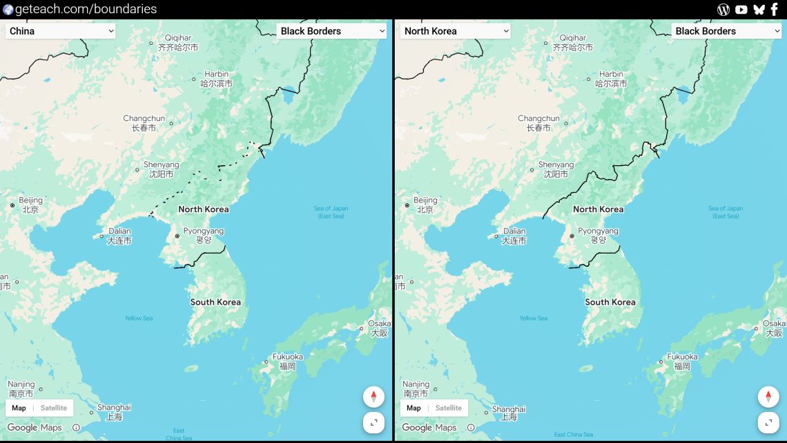
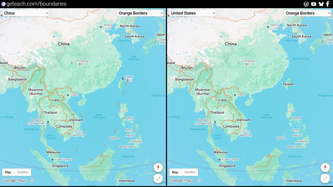
Left Map Region: China | Right Map Region: North Korea

China set as the region with North Korea, panning along the North Korean border. Worth comparing against a neutral region to see which boundary treatment China’s version defaults to.


Left Map Region: China | Right Map Region: United States

China and United States set as the regions, centered on Taiwan. The label itself changes, not just the line around it, which makes for a sharper before/after than most of the other examples.


Other Google Maps API 3D Examples

Building a 3D World Cup Stadium Map with Google Maps & Street View

Google Maps 3D API – World Cup 2026: https://geteach.com/maps3d/worldcup2026/


For the 2026 World Cup, I wanted a way to explore all 16 host cities across the US, Canada, and Mexico — not as a flat map with pins, but as something you could actually fly into. The result uses Google’s new Maps 3D JavaScript API alongside classic Street View, stitched together with a custom sidebar.

Google Maps 3D API Documentation: https://developers.google.com/maps/documentation/javascript/reference/3d-map

Here’s how the pieces fit.

The 3D layer


The map itself is a Map3DElement — part of the maps3d library and loaded dynamically via google.maps.importLibrary. It opens in satellite mode, tilted flat, looking down at North America:

let map = new Map3DElement({
  center: { lat: 36.337, lng: -63.598, altitude: 2233 },
  mode: MapMode.SATELLITE,
  tilt: 0,
  range: 63167767
});

Each stadium gets a Marker3DInteractiveElement with a custom-colored PinElement — red for Canada, green for Mexico, blue for the US — clickable to jump straight to that city.

The fun part: flying the camera


The signature feel of the site comes from map.flyCameraTo(), which animates the camera between two positions. I wrote a small Flyto() wrapper that takes a center point, heading, tilt, range, roll, and duration, and every stadium page in the sidebar triggers its own flight when selected.

The hard part wasn’t the API — it was finding good camera angles. There’s no UI for “drag the camera until it looks right,” so I bound a keyboard shortcut (Ctrl+Space) that dumps the map’s current center, heading, tilt, range, and roll to the console. I’d fly around manually, hit the shortcut when I found an angle I liked, and paste the values straight into the stadium’s entry. It’s a crude workflow, but it turned manual camera-hunting into something fast enough to do for all 16 stadiums in one sitting.

Street View, the old-school way


Each stadium page also embeds a classic StreetViewPanorama — no 3D involved, just the regular Street View service. This had its own quirks:

  • Saved panoIds aren’t permanent. Google occasionally retires or swaps panorama IDs, so I built a fallback: try the saved panoId first, and if that fails, fall back to a getPanorama() lookup by lat/lng with a small search radius.
  • Hidden containers don’t render. Street View panoramas measure their container’s dimensions on init — if you initialize one while its parent is display: none (which mine were, since they live in collapsed sidebar pages), you get a blank gray box. I solved this with a visibility poll: each panorama waits, checking every 100ms, until its container actually has rendered dimensions before initializing.

The sidebar, built by hand

Rather than reach for a UI framework, the entire sidebar — table of contents, pagination arrows, collapse/expand, label and pin toggles — is vanilla JS syncing against a single source of truth: a currentpage attribute on a custom <sidebar-pagination> element. Every interaction (clicking a TOC item, clicking a map pin, hitting next/prev) funnels through that one attribute, which then triggers the camera flight and swaps the visible panel. It’s not React-level elegant, but for 16 fixed pages it kept the logic easy to trace.

A known rough edge: rapid clicking

One thing worth flagging if you build something similar: both APIs can get unstable if a user clicks around quickly — jumping between stadiums, mashing the next/prev buttons, or rapid-toggling the Street View panel. This doesn’t seem to be a bug in my code so much as something baked into the APIs themselves right now.

For the 3D side, the Maps 3D API is still in Preview (not General Availability), and Google’s own best-practices guide for it recommends sequencing actions off gmp-steadystate and gmp-animationend events rather than firing camera moves back-to-back — which suggests overlapping flyCameraTo() calls before the previous one resolves is a known stress point, not just something I happened to hit.


Street View has its own long-standing quirk: rapidly toggling a panorama’s visibility can leave it in a broken state where getVisible() reports true but nothing is actually rendered. This has been reported as far back as 2010, and the old workaround people found was nudging the POV or zoom slightly to force a redraw — which lines up with the “needs a mouse shake” behavior I’ve seen. I haven’t found anything suggesting Google has fully fixed this at the API level.

Net takeaway: if you’re building on either of these, debounce rapid input where you can, and don’t assume every glitch is your own code.

What I’d explore next

The Maps 3D API is still relatively new, and it shows in small ways. One I noticed: Google Earth Pro has had a declarative KML touring format for years — you define a playlist of fly-tos, waits, and sound cues as data, and the player runs the whole sequence for you. Maps 3D doesn’t have anything like that yet; flyCameraTo() and flyCameraAround() only handle one leg of a flight at a time, so chaining a full multi-stop tour (like flying through all 16 stadiums) means hand-rolling your own sequencing with gmp-animationend listeners — which is basically what my Flyto() wrapper does. A KML-style tour playlist for Maps 3D would be a neat addition. It’s also genuinely demanding on hardware: it’s rendering photorealistic 3D tiles in real time, and on lower-end graphics cards I’ve seen it struggle or crash outright, independent of anything related to clicking. For now, manual camera-hunting plus a console-dump shortcut got the job done. While I am at it… would love a way to programmatically disable the clouds.

If you’re building something similar, the maps3d + Street View combination works well together — just budget extra time for the visibility timing issues Street View doesn’t usually have on a normal page.

Other Google Maps API 3D Examples

Teaching “The Why of Where”: A Bivariate Climate Map Lesson for AP Human Geography

Here is a question that sounds simple but gets complicated fast: why do people live where they do?

The standard answer — people cluster near water, fertile land, and mild climates — is true but incomplete. It doesn’t explain why the North China Plain supports one of the densest agricultural populations on Earth while the Amazon Basin, also wet and warm, supports almost no one. It doesn’t explain why the Great Plains produce massive grain surpluses but not massive cities. And it doesn’t explain why cold, dry Inner Mongolia is covered in pasture rather than crops or people.

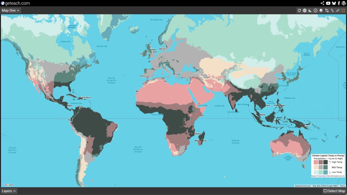
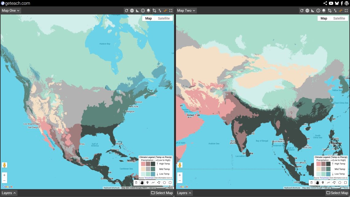
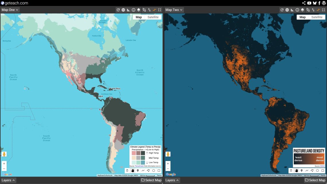
The new Bivariate Climate layer on geteach.com makes the underlying logic visible. By blending mean annual temperature and total annual precipitation into a single 2D color grid, it reveals the climate matrix that sets the terms for everything else — which land gets farmed, which land gets grazed, and where humans ultimately concentrate. Pair it with the Cropland, Pastureland, and Population Density layers and you have a four-map inquiry sequence that runs from physical geography to human geography in a single class period.

This lesson works for AP Human Geography Units 1, 2, and 5, NGSS MS-ESS2-6 and HS-ESS2-4, and Geography for Life Standards 7, 8, 9, and 15.


What the Bivariate Climate Layer Shows

Most climate maps show one variable at a time — temperature or precipitation, but not both simultaneously. The Bivariate Climate layer uses a 2D color scale to show both at once, for the 20-year period from 2004 to 2023.

The logic of the color grid is straightforward:

  • Temperature runs on one axis — from cold blues to warm reds
  • Precipitation runs on the other — from dry yellows to wet greens
  • Where the two intersect produces the blended color that represents that location’s full climate character

The result is a map that encodes the climate regimes that define Earth’s biomes in a single visual layer. Hot and wet is deep teal-green — tropical rainforest. Hot and dry is amber-red — tropical desert. Cold and wet is blue-green — boreal forest and tundra. Cold and dry is pale blue-grey — polar desert. The color a location wears tells you almost everything you need to know about what grows there, who can live there, and how many of them.

Load it on Map 1 at geteach.com: Select Map → Physical Geography → Climate → Bivariate Climate. Leave it there for the whole lesson.


The Lesson: Four Maps, One Argument

The lesson runs through four layers in sequence. Each layer adds one piece to the argument. By the end, students have built a geographic explanation for global population distribution from the ground up — starting with climate and ending with human settlement.

Setup: Use geteach.com’s dual-canvas interface throughout. Keep Bivariate Climate on Map 1 the entire time. Swap the comparison layer on Map 2 as the lesson progresses.


Map 1 — Bivariate Climate (Map 1, stays all lesson)

Load Bivariate Climate Layer: Select Map → Physical Geography → Climate → Bivariate Climate

Give students two or three minutes to read the map before saying anything. Then ask:

“What are the largest color zones on this map? What do you think those colors mean?”

After students describe what they see, introduce the bivariate logic: one axis is temperature, one is precipitation, and the color is the intersection of both. Walk through a few anchor examples together:

  • The Congo Basin and Southeast Asia — deep blue-green: hot and very wet. This is tropical rainforest climate.
  • The Sahara and Arabian Peninsula — deep red-amber: hot and very dry. This is tropical and subtropical desert.
  • The Canadian Shield and Siberia — cool blue-green: cold and moderately wet. Boreal forest (taiga) climate.
  • The American Great Plains and Central Asian steppe — warm tan-gold: temperate but dry. Grassland and semi-arid climate.
  • Western Europe and the US Pacific Northwest — warm and moderately wet: the mid-latitude sweet spot where most of the world’s agricultural surplus is produced.
Open this view in geteach.com

Key question before moving on:

“If you were going to predict where on Earth humans grow most of their food, which colors would you look for? Which colors would you rule out immediately?”

Have students write or discuss their predictions. Then load Map 2 to check.


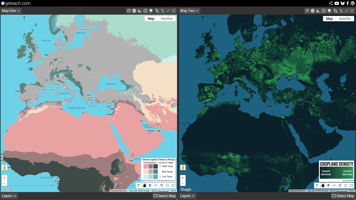
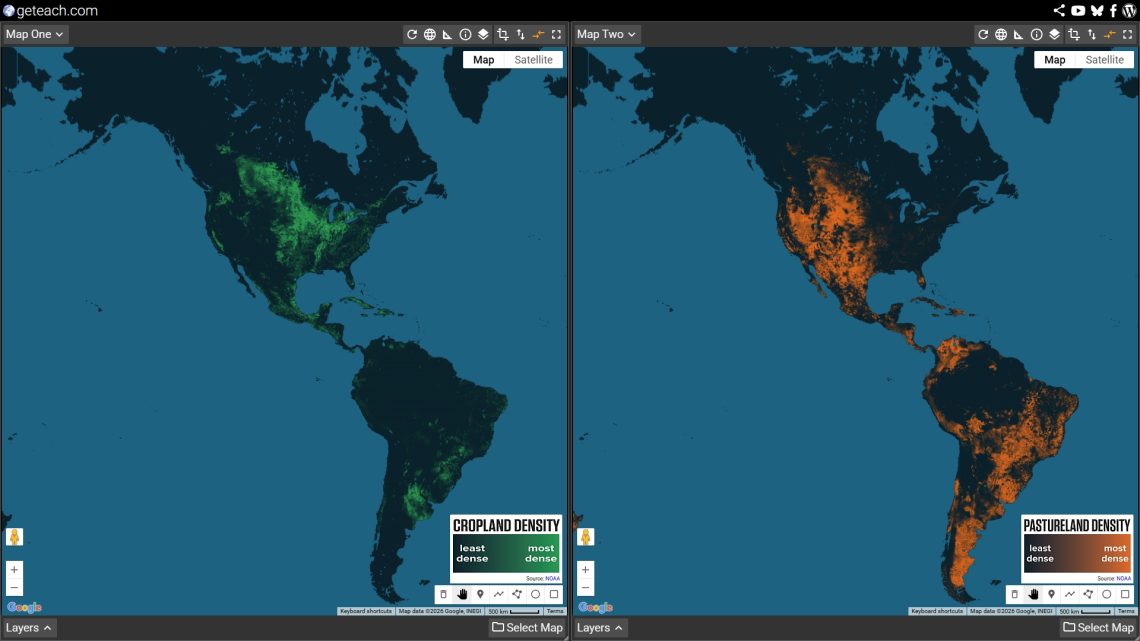
Map 2 — Cropland (Map 2)

Load Cropland Layer: Select Map → Human Geography → Geography Land → Cropland

Now students compare their climate predictions against actual global cropland distribution.

“Does the cropland map confirm your predictions? Where does it surprise you?”

The major patterns that emerge from this comparison:

  • The temperate band matches almost exactly. The Northern Hemisphere’s great agricultural zones — the North China Plain, the European Plain, the US Corn Belt, the Canadian Prairies — all sit in the warm-to-mild, moderately wet bivariate colors. Not the wettest, not the driest. The middle.
  • Hot and wet ⁄ farmland. The tropical rainforest zones (Congo, Amazon, Southeast Asian interior) show surprisingly little cropland relative to their rainfall. The soils beneath tropical forest are often thin and nutrient-poor — the nutrients are locked in the biomass, not the ground. When forest is cleared, productivity drops quickly without heavy inputs.
  • Hot and dry ⁄ farmland, with exceptions. Deserts are blank on the cropland map — except in the Nile Valley, the Indus Valley, and California’s Central Valley, where river systems or irrigation allow agriculture to bypass the climate constraint entirely. These are worth pausing on: they are places where humans broke the climate-agriculture relationship through water engineering.
  • The monsoon exception. Parts of South and Southeast Asia, including the Indo-Gangetic Plain, show significant cropland in climates that look too hot and wet on the bivariate map. Intensive agriculture (particularly wet-rice cultivation) is adapted to flooded, monsoon conditions that would destroy other crops — a cultural and agricultural technology that unlocked immense food production in climate zones most other farming systems could not use.
Open this view in geteach.com

Discussion question:

Environmental Determinism argues that the physical environment dictates human activity. Based on the cropland map, where does this theory seem to hold true, and where do humans demonstrate Possibilism?”


Map 3 — Pastureland (Map 2)

Load Pastureland Layer: Select Map → Human Geography → Geography Land → Pastureland

Swap Cropland for Pastureland. The shift is immediate and striking.

“What do you notice about where pastureland is compared to where cropland was? What bivariate colors does pastureland occupy that cropland didn’t?”

Pastureland is the land use that fills the gaps cropland cannot:

  • The semi-arid and dry belts. The Sahel, the Central Asian steppe, the Argentine Pampas, the Australian interior, the American Great Basin — all too dry for reliable crop agriculture, but grasses grow, and grass can be converted to food through livestock. Pastoralism as a land use is a climate adaptation strategy.
  • The cold northern margins. Mongolia, northern Scandinavia, highland Central Asia — too cold and too short a growing season for crops, but reindeer, yak, and sheep can graze on what grows. Nomadic and semi-nomadic pastoralism is a rational response to cold-dry bivariate zones that would show up as cool blue-grey on the bivariate map.
  • The tropical savannas. Sub-Saharan Africa and northern Australia show heavy pasture in warm-but-seasonally-dry bivariate zones. The wet season produces grass; the dry season forces movement or hay storage. The long-distance cattle drives and seasonal transhumance that define these regions are written into the climate.
  • Where pastureland and cropland overlap. Some of the most productive agricultural regions — parts of the US Great Plains, the South American Pampas, parts of Europe — show both. Mixed farming systems rotate crops and livestock on the same land, a strategy that reflects moderate climates where both are viable.
Open this view in geteach.com

Key insight to draw out:

“If cropland follows the moderate, reliable climates, pastureland follows the marginal ones — too dry, too cold, or too seasonal for crops but not empty. Together, cropland and pastureland show us how humans have colonized almost every climate zone on Earth by matching their food production system to what the climate allows.”

Optional: Change Map 1 to the “Cropland” layer and compare Cropland (Map 1) with “Pastureland” (Map 2). This side-by-side view highlights the spatial division between intensive and extensive land-use patterns. Once you have completed your comparison, change Map 1 back to the “Bivariate Climate” map layer to anchor the final step of the lesson.

Open this view in geteach.com

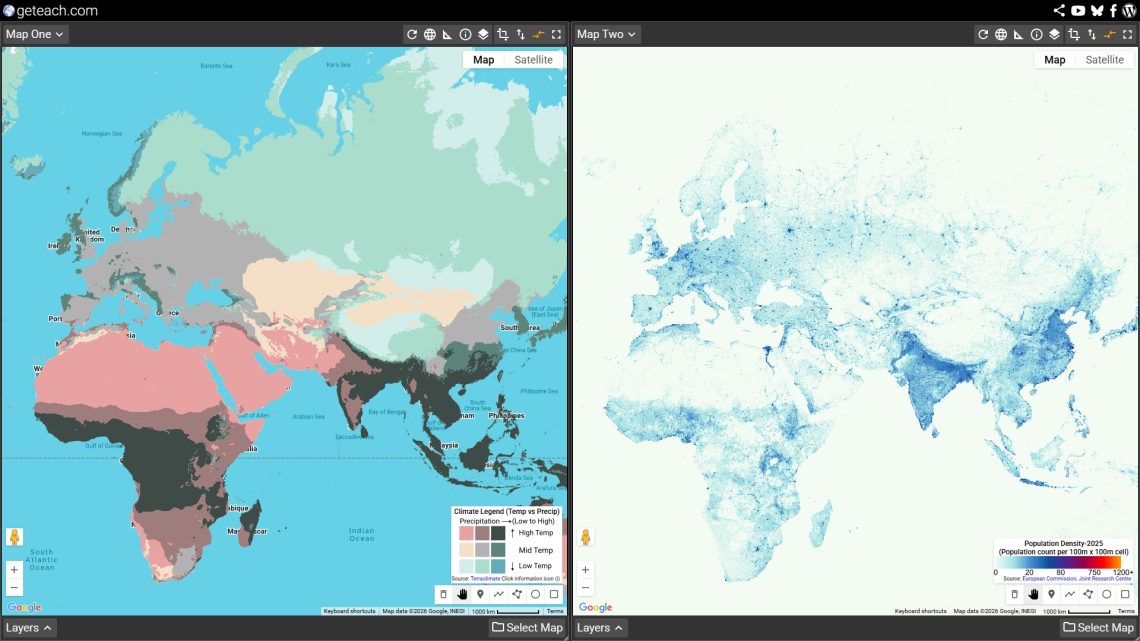
Map 4 — Population Density (Map 2)

Load: Select Map → Human Geography → Population Density → Population Density 2025

“We’ve now seen where climate allows farming and where it allows grazing. Where do people actually live? Does population density follow cropland, pastureland, or something else entirely?”

The comparison between bivariate climate and population density 2025 produces the lesson’s most important observations:

  • Population density closely tracks cropland, not pastureland. The dense population bands of East Asia (North China Plain) and Europe sit squarely on the same temperate-to-subtropical, moderately-wet bivariate colors as the major cropland zones. High agricultural productivity is the engine that supports dense human settlement.
  • The great pastoral regions are sparsely populated. Mongolia, the Sahel, the Australian interior, and Central Asia — enormous pastoral zones — support very low population densities. Because these extensive food systems produce fewer calories per square kilometer than grain agriculture, they support lower arithmetic densities.
  • The tropical rainforest disconnect. The hot-wet zones that are neither major cropland nor major pastureland (like the Amazon and Congo Basins) are also not densely populated. Despite being climatically energetic, these regions have low carrying capacities for human settlement without massive external inputs.
  • The coastal and river exception. Where the bivariate map shows climatically marginal zones (deserts), population density often spikes along rivers — places where access to water and trade routes override the climate signal. The Nile, Indus, and Yellow River valleys show up as “population islands” in challenging climates, illustrating Possibilism.
  • The monsoon mega-cluster. The single densest population zone on Earth — the arc from the Ganges Plain through South China to the Yangtze Valley — sits in a warm, monsoon-wet bivariate zone. Here, intensive agriculture unlocked climate potential that other farming systems could not reach. Over three billion people live within this specific bivariate color band.
Open this view in geteach.com

Synthesis question:

“Based on all four maps, write one or two sentences that explain the geographic logic connecting climate to land use to population density. Where does the logic hold? Where does it break down, and what human factors explain the exceptions?”


Assessment Options

Quick Check (5 minutes)

Display the bivariate legend and three bivariate color swatches. Ask students to predict: (1) whether this climate zone is likely to support cropland, pastureland, or neither; and (2) whether it is likely to have a high or low population density. Justify each answer using the lesson’s logic.

Written Response (15–20 minutes)

Choose one of the following locations. Using the four maps from today’s lesson, explain why this location has the population density it does. Your explanation should begin with climate, move through land use, and end with population. Identify at least one place where the climate-to-population logic holds and one exception within the same region.

  • The Ganges Plain (India)
  • The Sahel (West Africa)
  • The Great Plains (United States)
  • The Mekong Delta (Southeast Asia)
  • Patagonia (Argentina)

Map Annotation (Homework or in-class extension)

Take a screenshot of your two-canvas comparison from geteach.com. Using an annotation tool, identify the following:

  • Three locations where the bivariate climate directly explains the land use and population density patterns.
  • One location where human intervention (such as irrigation, technology, or trade) overrides the climate constraint to support higher density or agriculture.

Extensions and Connections

Connect to the Human Climate Niche

After completing this lesson, load the Human Climate Niche — 2020 and Human Climate Niche — 2070 layers from the Climate mapset. The niche maps show which bivariate zones humans have preferred for 6,000 years — and which zones are projected to fall outside that range by 2070 under high-emissions scenarios. Ask: if the climate-to-population logic holds, what happens to population distribution when the bivariate color of a place changes?

Add the Vegetation Index

Load any month of the Vegetation Index (NDVI) alongside the Bivariate Climate layer. The NDVI shows living plant cover — the biological output of the climate the bivariate map measures. July is particularly useful: it shows Northern Hemisphere peak greenness and reveals how closely photosynthetic productivity tracks the bivariate color pattern.

Climate Graph Challenge

After students understand the bivariate logic, use the Climograph Challenge game (accessible from the main platform) to test whether they can identify a location’s bivariate zone from its temperature curve and precipitation bars alone. A student who can read a climograph and place a pin in the right bivariate zone is demonstrating genuine climate-space reasoning.

Food vs. Feed

Swap Cropland for Food vs. Feed (Geography Land mapset). This layer shows what share of cropland production goes to direct human consumption versus animal feed. The comparison with bivariate climate adds a second dimension to the land use argument: in the high-productivity temperate zones, much of the agricultural surplus goes not to feeding people directly but to feeding livestock — a caloric inefficiency that connects back to the population density patterns students observed.


Curriculum Alignment

Framework Standards
AP Human Geography Unit 1 (1.4 — physical geography and human activity); Unit 2 (2.3, 2.4 — population distribution and density); Unit 5 (5.1, 5.2 — agricultural origins and land use; 5.6, 5.7 — food production systems)
NGSS MS-ESS2-5; MS-ESS2-6 (weather and climate systems); HS-ESS2-4 (climate variability); HS-ESS3-1 (natural resources and human systems); HS-ESS3-3 (human impacts on Earth systems)
Geography for Life Standard 7 (physical processes shaping Earth’s surface); Standard 8 (ecosystems and biomes); Standard 9 (characteristics and distribution of human populations); Standard 15 (how physical systems affect human systems); Standard 16 (resources and their use)

Layers Used in This Lesson

All layers are free, require no login, and are accessible at geteach.com.

Layer Mapset Role in Lesson
Bivariate Climate Climate Anchor layer — stays on Map 1 throughout. Sets the climate context for every other comparison.
Cropland Geography Land Map 2 — tests the prediction that moderate, reliable climates drive agriculture.
Pastureland Geography Land Map 3 — shows how marginal climates (too dry, too cold, too seasonal) are colonized through livestock rather than crops.
Population Density 2025 Population Density Map 4 — the human outcome. Tests whether climate-driven land use explains where people actually live.

Use the share icon on geteach.com to capture any two-canvas configuration as a permanent link you can distribute to students or embed in a slide deck. No account required.

Mapping the Brexit Divide with geteach.com: An AP Human Geography Review of Scale and Sovereignty

Overview

This end-of-year review lesson uses the Brexit Results 2016 map set on geteach.com to connect four AP Human Geography topics in a single, map-driven activity. A decade after the referendum, Brexit remains one of the most geographically rich case studies available for the AP exam—touching on scale of analysis, centrifugal and centripetal forces, supranationalism, and international trade all at once.

The map set has eight layers organized along two dimensions: scale of analysis (national → sub-national nations → regions → local) and color complexity (simple binary vs. gradient choropleth). That structure is not accidental—it is the core of the lesson.

Shared Map Link

AP Human Geography Alignment

  • Topic 1.6 — Scales of Analysis
  • Topic 4.8 — Supranationalism
  • Topic 4.9 — Challenges to State Sovereignty (Centrifugal and Centripetal Forces)
  • Topic 7.6 — Trade and the World Economy
    • Learning Objective PSO-7.A: Explain causes and geographic consequences of recent economic changes such as the increase in international trade, deindustrialization, and growing interdependence in the world economy.
    • Essential Knowledge PSO-7.A.2: Neoliberal policies and free trade agreements (specifically analyzing the EU).
    • Essential Knowledge PSO-7.A.3: Government initiatives at all scales and their effects on economic development, including tariffs.

Background Reading: Brexit, A Decade Later (2016–2026)

On June 23, 2016, the United Kingdom held a historic national referendum to answer a single question: Should the UK remain a member of the European Union, or leave it? In a result that shocked the global political and economic establishment, the UK voted to leave by a narrow margin: 52% Leave to 48% Remain.

To understand this vote, you have to understand the competing forces at play:

  • The “Leave” Campaign: Driven by a desire to “take back control,” Leave voters argued that EU membership eroded British sovereignty. They wanted the UK to have full control over its own borders, immigration policies, and laws, free from the regulations of a supranational organization based in Brussels.
  • The “Remain” Campaign: Driven by economic pragmatism, Remain voters emphasized the massive benefits of the EU’s single market. They argued that frictionless trade, tariff-free supply chains, and the freedom of movement for workers were essential to the UK’s economic survival and global influence.

The 10-Year Reality

“Brexit” (British exit) was not an overnight event. It took years of painful political negotiations to untangle decades of integration. The UK officially left the EU in 2020. Today, a decade after the original vote, the UK continues to navigate the complex economic and political realities of standing outside Europe’s massive neoliberal trade bloc.

The Geographic Puzzle

If you look only at the final national score—52% to 48%—you might assume the entire country was evenly divided. But geography tells a different story. The vote fractured the UK along national borders, regional economies, and urban/rural divides. In this activity, we will use maps to uncover exactly where the UK divided, why those divisions happened, and what it tells us about scale, supranationalism, and global trade.

Essential Question

What does the 2016 Brexit vote reveal about the relationship between scale of analysis, centrifugal forces, supranationalism, and global trade interdependence—and how have those geographic realities played out a decade later?

Understanding the Map Set

Before launching the lesson, it helps to understand how the eight layers are structured. Students will need to load these layers onto the dual map canvases in geteach.com.

To load a layer, students must complete the following steps on both map canvases:

  1. Click Select Map in the bottom right corner of the canvas.
  2. Choose Special Collections.
  3. Select Brexit.
  4. Click any layer name to load it onto that canvas.

Note: Because geteach.com uses a dual-canvas layout, students will repeat this process on both the left and right map canvases to compare different layers side-by-side.

The Four Simple (Binary) Layers

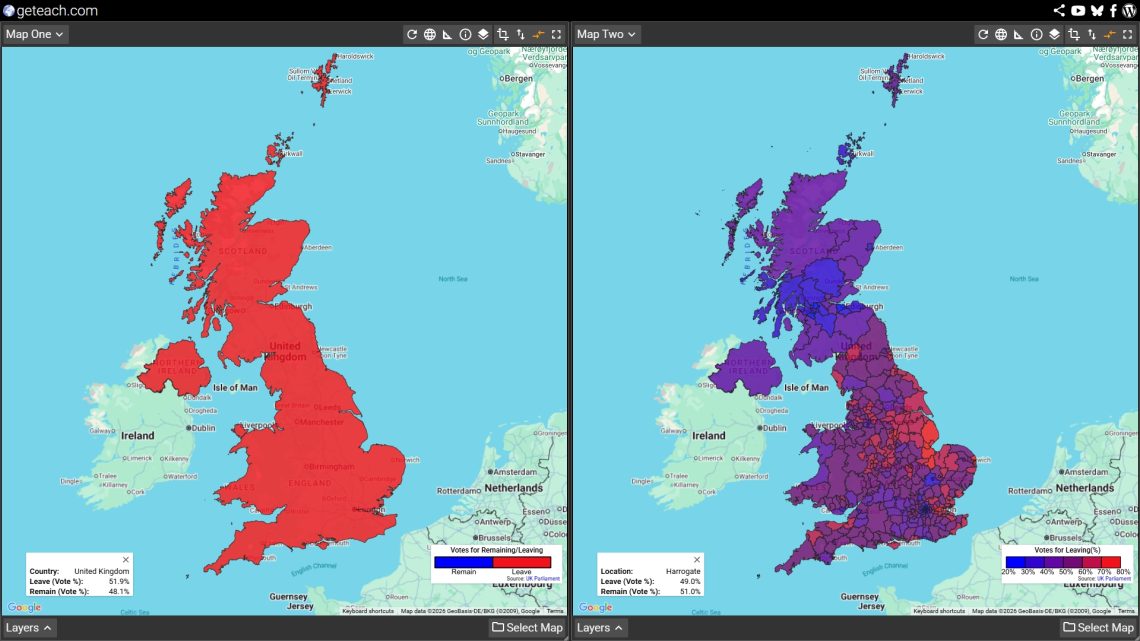
These layers use only two colors: blue for Remain and red for Leave. The outcome at each geographic unit is shown as a clean win/loss with no information about the margin of victory.

  • United Kingdom (Simple): The entire UK as a single unit. One color. One result. Useful only as a starting point.
  • UK Nations (Simple): England, Scotland, Wales, and Northern Ireland shown as four units. The Scotland/Northern Ireland vs. England/Wales divide becomes immediately visible.
  • UK Regions (Simple): The nine regions of England plus the other nations. London appears as a Remain outlier inside a Leave-voting England.
  • UK Local (Simple): Individual local authority areas across the whole UK. The urban-rural patchwork becomes clear at this scale.

The Four Gradient (Complex) Layers

These layers use a color gradient from deep blue (strong Remain) to deep red (strong Leave), ranging from 20% to 80% Leave vote in 10-point intervals. Areas where the vote was close—roughly 40% to 60% Leave—appear in shades of purple. These are the genuinely contested places.

  • United Kingdom (Complex): Gradient applied to the whole UK as one unit. Shows the overall national margin.
  • UK Nations (Complex): Gradient by nation. Students can compare how strongly Scotland voted Remain versus how narrowly Wales voted Leave.
  • UK Regions (Complex): Gradient by English region plus nations. The variation within England becomes visible; some regions voted Leave by large margins, others by very thin ones.
  • UK Local (Complex): The most detailed view. A genuine heat map of Euroskepticism across the UK, with university cities and urban cores often appearing as blue islands inside a red countryside.

How to Set Up geteach.com for This Lesson

The dual-canvas layout in geteach.com is what makes this lesson work. Here is a step-by-step setup for each activity.

Loading a Layer

  1. Go to geteach.com.
  2. Click Select Map at the bottom right of either map canvas.
  3. Choose Special Collections from the menu.
  4. Select the Brexit map set.
  5. The layer panel will open. Click any layer name to load it.
  6. Repeat on the second canvas to load a different layer for comparison.


Interacting with the Data

Click for Exact Percentages: On any layer, students can click directly on a specific polygon (a nation, region, or local authority) to reveal a pop-up showing the exact Leave and Remain voting percentages for that specific geographic unit. This is highly recommended during the gradient layer activities so students can investigate exactly how close the margins were in the contested areas.

Recommended Canvas Pairings by Activity

Note: The Synchronize Maps feature (found in the Map Canvas caret menu) is turned on by default. Leave this enabled so both canvases pan together as students compare layers. This keeps both maps centered on the same area while showing different data.

Activity Left Canvas Right Canvas Why This Pairing Works
Warm-up United Kingdom (Simple) United Kingdom (Complex) Same scale, different classification. Students see what binary hides.
Scale walk UK Nations (Complex) UK Local (Complex) Largest and smallest aggregation side by side. The scale of analysis shift is clearly visible.
Forces analysis UK Nations (Simple) UK Nations (Complex) Students classify forces per nation, then check margin strength on the gradient.
Trade geography UK Regions (Complex) UK Local (Complex) Region-level economic patterns visible, with local detail available for drill-down.
Retrospective UK Nations (Complex) UK Regions (Complex) Return to the sub-national picture to anchor the 10-year discussion.

Sharing a Pre-Configured View

You can set up the exact canvas configuration you want—layers, zoom level, map position, legend visibility—and then click the Share icon to generate a single link. Paste that link into your LMS or Google Classroom, and students will open geteach.com already configured for the activity. No setup steps are needed on their end. See the geteach.com share function guide for details: geteach.com/blog/2026/03/20/new-share-function-geteach-com/

Lesson Sequence

Activity 1 — Binary vs. Gradient Warm-Up (Topic 1.6)

Load United Kingdom (Simple) on the left and United Kingdom (Complex) on the right. Ask students: What does the map on the left tell you? What does it hide? Then ask them to look at the right canvas. What new information appears?

The goal here is not Brexit—it is cartography. Classification choices shape what a map communicates. The simple layer shows a winner. The gradient layer shows a margin. Neither is wrong, but they tell different stories. This is the core idea of Topic 1.6 before any political geography even enters the room.

Activity 2 — The Scale Walk (Topic 1.6)

Have students work through the gradient layers from largest to smallest aggregation: United Kingdom → UK Nations → UK Regions → UK Local. For each layer, they record three things: the areas of deepest blue, the areas of deepest red, and the areas that appear purple (contested).

Key discussion question: The UK voted 52% Leave at the national scale. Does that match what you see at the local scale? How does changing the scale of analysis completely change the story the map tells? London is the most productive example: at the national or regional scale, its massive Remain vote is hidden by the broader Leave-voting English data. But at the local scale, it reappears as a strong blue island surrounded by Leave-voting outer boroughs and the Home Counties.

Activity 3 — Supranationalism & Centrifugal Forces (Topics 4.8 & 4.9)

Load UK Nations (Simple) on the left and UK Nations (Complex) on the right. Using the four nations as the unit of analysis, students identify centripetal forces that held each nation to a Remain position and centrifugal forces that pushed toward Leave.

Productive examples by nation:

  • Scotland (Strong Remain): Centripetal forces included EU single market access for agriculture and fishing, and a strong Scottish national identity that was pro-European rather than anti-Westminster. The ongoing independence movement saw EU membership as compatible with Scottish sovereignty.
  • Northern Ireland (Strong Remain): Centripetal forces included the Good Friday Agreement’s open border with the Republic of Ireland, cross-border economic integration, and EU structural funds. A Leave vote carried the threat of a hard border—a genuinely destabilizing centrifugal force.
  • Wales (Narrow Leave): Despite receiving substantial EU structural funds, Wales voted Leave. This is a highly productive tension for students to examine regarding cultural vs. economic priorities.
  • England (Leave): Centrifugal forces included concerns about immigration and sovereignty, a sense that EU institutions were unaccountable, and geographic/cultural distance from the visible benefits of EU membership.

Closing Meta-Question: Is Brexit itself a centrifugal or centripetal force? At the global regional scale (Europe), it is centrifugal, pulling the UK out of the supranational bloc. But at the sub-national region scale (within the UK), it also functions as a centrifugal force, intensifying Scottish independence pressure and complicating Northern Ireland’s constitutional status.

Activity 4 — Trade Geography (Topic 7.6)

Load UK Regions (Complex) on one canvas and zoom to England. This activity connects the vote geography directly to the causes and consequences of international trade (PSO-7.A). Walk students through each essential knowledge point using the map as evidence:

  • PSO-7.A.1 (Comparative advantage & complementarity): Which UK regions had the most to gain from EU single market access? London’s financial services, the Southeast’s knowledge economy, and Scotland’s agricultural exports all had strong comparative advantages within the EU framework. Ask: Does the gradient map reflect which regions felt those advantages most?
  • PSO-7.A.2 (Neoliberal trade blocs): The EU is a primary example of this concept. Brexit is the ultimate case study of a state exiting a bloc. What spatial connections (supply chains, labor movement, cross-border investment) were disrupted?
  • PSO-7.A.3 (Tariffs & government policy): Post-Brexit tariff and customs arrangements completely reshaped economic geography. Northern Ireland is the sharpest example: the Windsor Framework created a different trade relationship for Northern Ireland than for the rest of the UK, effectively meaning two different regulatory environments within one sovereign state.
  • PSO-7.A.4 (Interdependence & shifting connections): The UK has since signed trade agreements with Australia and Japan, and joined the CPTPP. Ask students: Do these new connections replace the geographic proximity of the EU, or do they represent a fundamentally different kind of global interdependence?

A productive geographic puzzle: The regions that voted most strongly for Leave (parts of the East Midlands, the Northeast, Wales) were often among the largest recipients of EU structural funds and had significant EU trade exposure. Why might regions that economically benefited from EU membership vote to leave? This forces students to weigh economic geography against cultural and political geography.

Activity 5 — A Decade Later: Retrospective Synthesis (Topics 4.8, 4.9, 7.6)

Return to the UK Nations and UK Regions complex layers. A full decade has passed since the 2016 referendum. Use the maps as a spatial anchor for a 2026 retrospective discussion.

Discussion prompts:

  • Did the reality of Brexit resolve the centrifugal pressures visible in the 2016 map, or intensify them? (Consider the modern Scottish independence movement, the Northern Ireland border realities, and shifting demographics).
  • The purple zones on the gradient layers—the genuinely contested 40–60% areas—represent places where geography did not produce a clear consensus. Ten years on, have those local communities resolved their economic and political tensions, or does the data suggest it persists?
  • Looking at the global economy today, has the UK successfully replaced EU trade interdependence? What does the current geographic evidence suggest about whether distant bilateral agreements can compensate for the loss of a neighboring regional trade bloc?

Discussion Questions by Topic

  • Topic 1.6: At the national scale, the UK voted 52% Leave. At the local scale, London voted roughly 60% Remain. How does this illustrate the limitations of national-scale analysis for understanding geographic patterns?
  • Topic 4.8: What specific benefits of EU supranationalism did Scotland and Northern Ireland rely on that England largely dismissed? Why might spatial geography—not just politics—explain that difference?
  • Topic 4.9: Is Brexit itself a centrifugal or centripetal force? Does your answer change depending on whether you analyze it at the UK-EU scale versus the within-UK scale?
  • Topic 7.6 (PSO-7.A.2): The EU is a prime example of a neoliberal trade organization. Using the gradient map, which UK regions appeared most spatially dependent on EU trade networks in 2016? Which appeared least?
  • Topic 7.6 (PSO-7.A.3): How did post-Brexit tariff and customs policy ultimately affect Northern Ireland differently from England? What does this reveal about the relationship between government scale and trade geography?
  • Synthesis: A classmate argues Brexit was “just politics, not geography.” Using all four AP HUG topics discussed today, write a 3–4 sentence rebuttal.

FRQ-Style Assessment Prompt

Refer to the 2016 Brexit referendum map at the regional scale using the gradient color scheme on geteach.com.

(A) Describe the geographic pattern of the Leave vote across UK regions.

(B) Explain how changing the scale of analysis from regional to local would alter the interpretation of this pattern.

(C) Using ONE centrifugal force and ONE concept from the causes and consequences of international trade, explain why the pattern you described exists.

Teacher Notes

15 Years of geteach.com: A Note on Sustainability and Privacy

You may have noticed a small pop-up on geteach.com recently asking if you’d like to “buy me a coffee.” I know…I know, nobody loves a donation prompt. As a teacher, I’ve always wanted this site to be a friction-less resource for the classroom.

However, after 15 years of building and maintaining this platform out of my own pocket, I want to be upfront about why that prompt is there, what the money covers, and why I’ve chosen this path instead of showing ads.

What it actually costs to run this

For a long time, I was able to keep costs very low. But as geteach.com has grown to over 1.3 million views and 300+ map layers, the technical requirements have changed.

Most months, the site costs me around $30–$40 to keep online. However, during high-usage months like this past March, that bill spiked to ~$106.00. There is no company subsidizing this, no ad revenue, and no investors. It is just a teacher covering the costs of a global classroom tool.

Here is exactly where that money goes:

What Why Typical Cost
Google Maps API The engine behind the maps. First 10k loads are free; after that, Google charges per 1,000 views. $0 – $70+/mo
Google Cloud Storage Powers the 300+ custom map layers and data backups. ~$10/mo
Google Workspace Keeps the site’s professional communication separate from my personal data. $9/mo
Domain & Hosting The “rent” for the geteach.com address and server space. ~$11/mo
Typical Total ~$35/mo

The philosophy: Why I don’t use ads

Most “free” tools for teachers aren’t actually free—they are often paid for by your students’ data. Companies harvest usage patterns and learning behaviors to share with third parties. This is a trend in educational technology that gives me concern.

If you’re not paying for the product, the product is usually your students.

I pay out of pocket specifically so I don’t have to do that. My deal is simple: you get a powerful, professional mapping tool, and your students’ information never leaves your classroom. No ads, no logins, no data mining.

A nerdy detail: How the pop-up works

For the CS and web development teachers: I wrote this prompt to be as private as the rest of the site. It uses localStorage to remember your preferences directly in your browser. Because I don’t use accounts and no data is ever sent to a server, the “thank you” flag follows the specific browser or computer you are using, not you as a user.

The logic is simple and designed to be a nudge, not a nag:

  • Clicking “Not right now” stores a timestamp that “snoozes” the prompt for 24 hours.
  • Clicking “Buy me a coffee” sets a flag that hides the prompt on that browser for one full year.

I chose a one-year window because the site’s fixed costs, like the domain and hosting, are billed annually. If you find geteach.com adds value to your students’ learning experience, a yearly donation is greatly appreciated and goes a long way toward making the platform self-sustaining.

Please keep in mind that because this is tied to your browser’s local memory, clearing your browser data or switching to a new computer will reset the flag. If that happens, there is no need to make a new donation; simply clicking the “Buy me a coffee” link again will reset the clock for that browser.

What happens if I don’t contribute?

Nothing changes. Every tool on geteach.com remains completely free and fully functional. The pop-up exists to make the costs visible, not to gatekeep the content. If you are a teacher and the budget isn’t there, please do not feel any pressure. Use the tool, teach the lessons, and enjoy the maps.

What your support actually does

When you buy me a coffee, you aren’t just buying me a drink—you are directly helping to pay the Google bill. You are signaling that a private, ad-free, and open educational web is worth keeping alive.

Thank you for 15 years of support, feedback, and map-viewing. Whether you can contribute or not, I’m glad you’re here.

☕ Buy me a coffee