Google Maps 3D API – Boundaries: https://geteach.com/boundaries
A quick note before I get into it: this is a side project, not part of my main classroom toolkit. GeTeach.com is still where I do the bulk of my actual teaching, and that’s not changing. This website is smaller in scope, built more to explore a specific idea than to replace anything. It’s also worth saying upfront that this build is running on the alpha channel of the Maps JavaScript API, not the standard weekly release, so some of what’s described here may change. I’ll switch the site over to the weekly channel once ROADMAP support lands there.
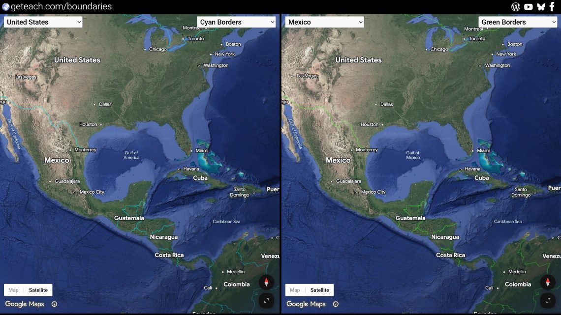
Most border disputes are invisible on a normal map. You get one line, drawn from one point of view, and that’s presented as fact. And it’s not just lines. Names shift too: the same body of water, mountain, or sea can carry two completely different labels depending on who’s making the map. The opening flight on this page lands over the Gulf of Mexico for exactly that reason. Set the region to US and it reads “Gulf of America”; set it to almost anywhere else and it reads “Gulf of Mexico (Gulf of America).” Same water, same coordinates, two names. Google Maps encodes both of these behaviors, borders and toponyms, through the API’s region parameter, which changes what gets rendered and labeled depending on which country’s context you tell it you’re in. So I built a page with two globes side by side, each locked to a different region, moving in perfect sync, so students can pan to the exact same spot on both globes and see two different perspectives of the same place, borders, names, and all, live.
Why digital maps do this
This isn’t a bug or an oversight. It’s deliberate, and every major map provider does some version of it, for both borders and toponyms. Companies operating in a given country are generally expected to follow that country’s legal or official position on its own territory and place names, and in several countries that’s not optional: showing a “wrong” border or a name a government hasn’t recognized can get a map product restricted, fined, or blocked outright. So rather than pick one global version of the truth, providers render borders and labels conditionally, keyed off the viewer’s country, domain, or in this case, an explicit region setting, so a map viewed from the US, Mexico, India, Pakistan, or anywhere else can show a version consistent with that country’s official stance, right down to what a body of water is called.
For a classroom, that’s less a technical footnote than the whole lesson. Most students assume a map is just a neutral picture of the world. Watching the same coordinates redraw their borders, or rename themselves, depending on which “region” you tell the API you’re in is a fast way to show them that maps are arguments too, made by someone, for someone.
Google Maps 3D API Documentation: https://developers.google.com/maps/documentation/javascript/reference/3d-map
Here’s how the pieces fit.
Two independent globes, one shared camera
Each side of the page is its own Map3DElement, wrapped in a small EarthView class that tracks its own camera state (center, range, tilt, heading) and exposes getCamera() / setCamera(). Nothing unusual there. The interesting part is keeping them locked together without one map fighting the other for control:
function createFocusSync(mapA, mapB) {
  let driver = null;

  const setDriver = (map, camera, stopped = false) => {
    if (stopped) { driver = null; return; }
    if (!map.isProgrammatic()) driver = map;
  };

  mapA.onCameraChange(setDriver);
  mapB.onCameraChange(setDriver);

  const tick = () => {
    if (driver && !driver.isProgrammatic()) {
      const follower = driver === mapA ? mapB : mapA;
      follower.setCamera(driver.getCamera());
    }
    requestAnimationFrame(tick);
  };
  tick();
}
Whichever globe the user is actively dragging becomes the “driver” for that gesture; the other globe just follows. The _isProgrammaticMove flag on EarthView is what keeps this from turning into an infinite feedback loop. Every time I set a camera programmatically, I flag it so the resulting gmp-centerchange event doesn’t get mistaken for a new user drag and hijack the driver role.
The region parameter is the whole point
Each Map3DElement gets its own region string, and a dropdown per side lets students swap it live:
setRegion(regionCode) {
  this.map.region = regionCode;
}
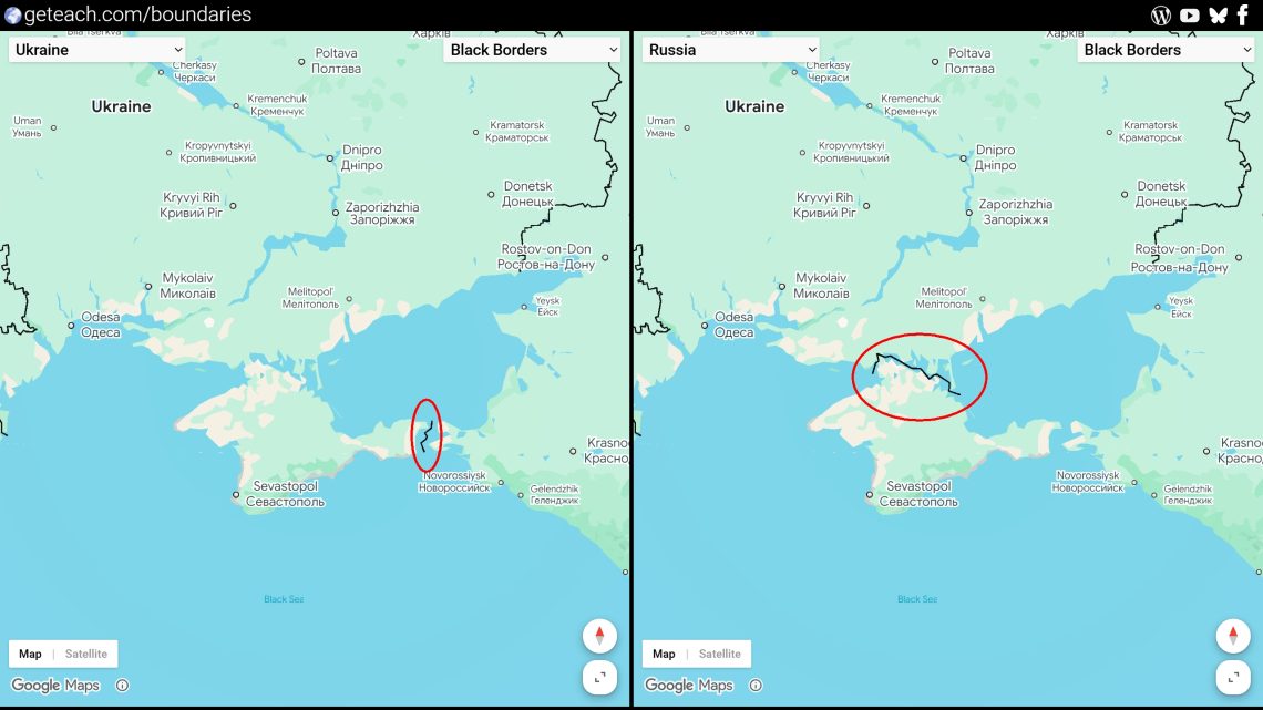
Left globe set to US, right globe set to RU, both centered on the same coordinates. Pan over to Crimea, and the two globes will label and border it differently, even though it’s the exact same latitude and longitude on both screens. That single-line diff is a better opener for a discussion on cartographic sovereignty than any lecture slide I’ve made.
Map mode, and boundary colors
Each globe defaults to a plain roadmap view rather than satellite hybrid, with a small Map/Satellite toggle button on the lower left so students can flip between the two. That pairs naturally with the color options below: roadmap keeps the background flat and neutral so the border color itself is the whole story, while satellite mode brings the terrain-contrast problem back in and lets students see why a color that worked over ocean might disappear over desert.
const setMapMode = (earthView, modeString, mapBtn, satBtn) => {
  if (earthView && earthView.map) {
    earthView.map.mode = modeString;
    if (modeString === 'ROADMAP') {
      mapBtn.classList.add('active');
      satBtn.classList.remove('active');
    } else {
      satBtn.classList.add('active');
      mapBtn.classList.remove('active');
    }
  }
};
I also wanted to swap the style of the borders, not just where they are but how visible they are, using six mapIds pre-configured with different boundary line colors: black, white, magenta, cyan, orange, and green. Satellite imagery isn’t one consistent background. Desert, forest, ocean, and snow all sit at different brightness and hue, so a border color that pops over one terrain can disappear over another. Having six colors on tap lets a teacher pick whichever one actually stands out against the terrain a lesson is centered on, rather than fighting a single fixed color that only works half the time. Widening the line itself would help too, since a thicker border reads better at a distance than a differently colored thin one, but Google Cloud’s map styling doesn’t currently expose a line-width control for these boundaries.
colorLeft.addEventListener("change", () => {
  if (window.leftEarth && window.leftEarth.map) {
    window.leftEarth.map.mapId = colorLeft.value;
  }
})
Worth a note on why the colors were finicky to begin with. The 3D API only supports cloud-based styling through the Google Cloud console, not the older, more predictable JSON styling most Maps developers are used to. On top of that, Google doesn’t currently offer a live preview for 3D styles, and changes can take a few hours to show up. Editing blind and waiting on a slow rollout meant I had to recreate a few of the color styles from scratch to get consistent results, even though they were all configured the same way underneath.
One dropdown, 190-some countries
The region and place-name behavior only works if students can actually pick a country, so both dropdowns are populated from a flat ISO 3166-1 alpha-2 lookup table at load time:
function populateSelect(selectEl) {
  for (const [code, name] of Object.entries(regions)) {
    const option = document.createElement("option");
    option.value = code;
    option.textContent = name;
    selectEl.appendChild(option);
  }
}
Defaults are US on the left and RU on the right, which was as good a first example of border/toponym divergence as I could think of. But the fun part of the lesson is letting students pick their own pair and go looking for the next one.
What I’d explore next
Three pairings I keep coming back to when I test this with students:
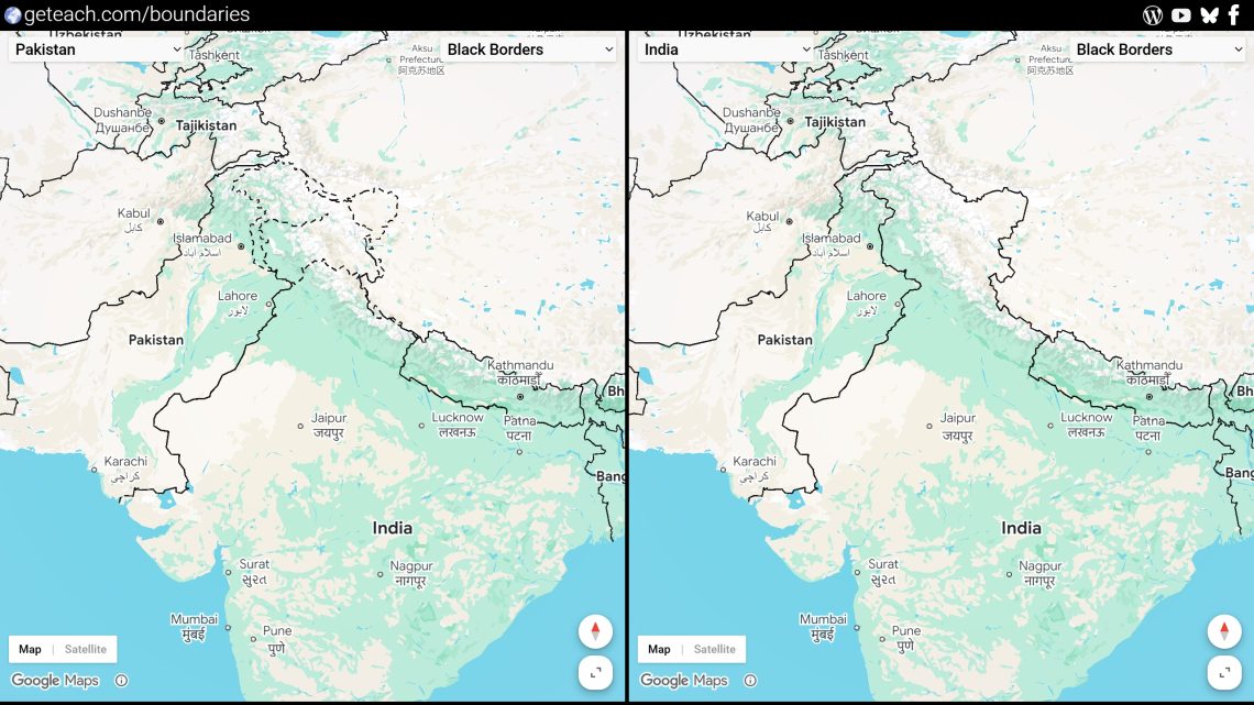
Pakistan set as the region with India, panning over Kashmir. The line of control gets drawn differently depending on which side of the page you’re looking at, and it’s a good prompt for asking students what a “border” even means when two governments won’t agree on one.
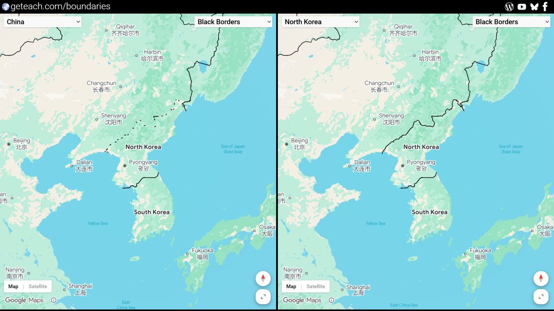
China set as the region with North Korea, panning along the North Korean border. Worth comparing against a neutral region to see which boundary treatment China’s version defaults to.
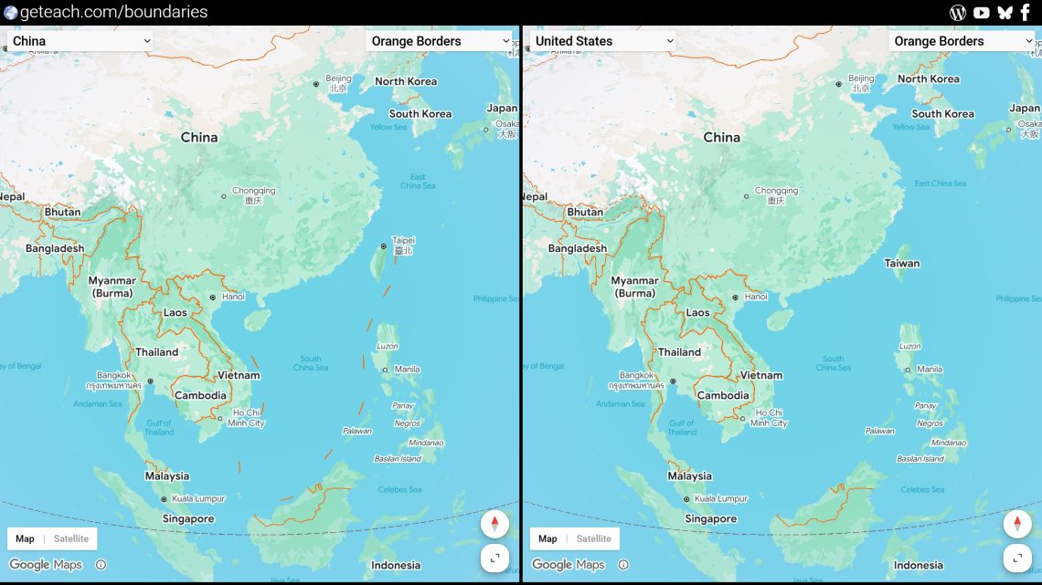
China and United States set as the regions, centered on Taiwan. The label itself changes, not just the line around it, which makes for a sharper before/after than most of the other examples.
Other Google Maps API 3D Examples
- World Cup Stadium Map: https://geteach.com/maps3d/worldcup2026/
- Planet Money Makes A T-Shirt: https://geteach.com/maps3d/tshirt/
- Neighborhoods Worlds Apart: https://geteach.com/maps3d/divide/
- US Geography Quiz: https://geteach.com/maps3d/usquiz/
- I’m Australian Too: https://geteach.com/maps3d/australiantoo/